In the world of affiliate marketing, most people focus on trying to get people to convert through the words they write and the images they use. However, there is a powerful psychological tool that many completely forget about; colour! In this guide we’ll take a look at the reasons why colours are so important in your campaigns and how they can influence your customers decisions.
When designing your campaigns, you have probably thought a bit about the colours you’d like to use, after all, you want your site to stand out, however, have you ever though about why you are using them and whether or not they will be sending out the right message?
In the world of advertising, executives and designers spend hours fine tuning the colours of logos and advertisements to make sure that they are exactly right. Why should affiliate marketing be any different?
Choosing the correct colours for your campaign can and will boost your conversions, so if you haven’t put much thought into your choices previously, now is the time to start. This guide will give you all of the information you need to make the right decision.
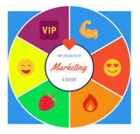
Colours
Red
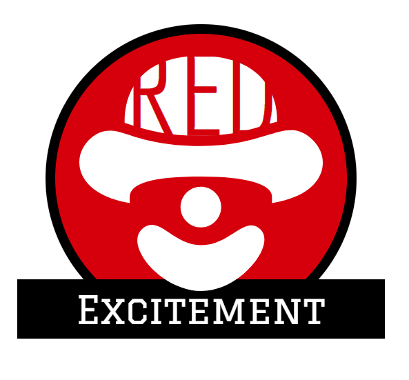
Red is one of the most powerful, if not the most powerful colour, you can use to advertise your products. It is the most eye catching which is why it has been adopted for warning signs around the world. If you want to send out a quick message and get people to really notice you then red is a great choice.
Red, in the marketing world, denotes excitement and will ensure that your customers don’t forget about your products. Red is also a great colour if you want to attract a younger audience.
There is also scientific evidence which has show that the colour red increases people’s the heartrates and appetites, hence it is often used my fast-food and drinks companies.
Famous companies that use red in their branding include:
- Coca Cola
- Nintendo
- Virgin
- Red Bull
- Lego
- Kellogg’s
Fun fact: Did you know that prior to 1931 Santa Claus wore green? The change came about because of a huge marketing campaign by Coca Cola, who are responsible not only for Santa’s red outfit, but also for turning him into the icon he is today. Now that’s good marketing!
Blue
According to a YouGov poll carried out in the U.K., blue is the most universally popular colour. It’s no surprise then that it is a great choice for your campaigns. However, make sure to choose the shade wisely depending on how you want people to view your brand. Here are 3 shades and their psychological impressions:
Light blue: creativity
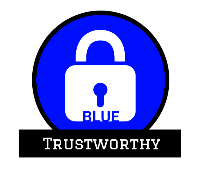
Sky blue: calm, secure and trustworthy
Dark blue: Intelligent and cold
Fun Fact: Seats on planes are usually blue because of the colour’s calming quality!
Yellow
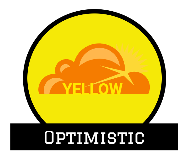
Yellow is associated with calm, warmth and creativity and is a great colour to choose if you want to pack a punch. It’s also the first colour that the eye processes, meaning that using it will ensure your ads get noticed more quickly.
Similarly to red, yellow is used by fast-food companies because it stimulates the tastebuds, so it’s no wonder that the McDonald’s Golden Arches on a red background has been such a hit.
However, because of it’s bright, attention grabbing quality, it can also be used to alert people to important aspects of you page e.g. calls to action.
Green
Green is synonymous with life, freshness and growth and is often used to market healthy lifestyle products.
Green is used in shops around the world to make customers feel more relaxed. It also harnesses the ability to promote decisiveness, so if you think people are thinking too long about whether or not to make that all important purchase, then using the colour green in your campaign might just be the answer.
Orange

Orange is created by mixing red and yellow and, as a result, it has some of the powers of both.
Orange is another bright colour and promotes friendship and optimism. However, it also stimulates excitement and is more likely to cause people to purchase products on impulse. Therefore, in the affiliate marketing industy, it is a very effective colour to work into your campaigns.
Purple
If you are looking to make waves in the beauty industry then purple will give your campaign the touch of class it needs to boost trust.
Associated with royalty, purple is a commanding colour that demands respect and using it in your campaigns will ensure that your customers pay attention.
Purple is one of the key creative colours and can be used to lend authority to your designs. It is also associated with wisdom, so if you want people to take your product seriously, then purple is a great way to go.